Web design consistency holds enormous value. The principal of web design consistency is maintaining design themes across repeating elements on your website. By accomplishing this you will create a uniform experience for your viewers. This leads to feelings of trust, steadiness, and faith in your message. When the design of your website is all over the place, it portrays a lack of focus and attention to detail.
Now, this doesn’t mean that every single element, section, button, etc. on your website needs to be the same, far from it. In fact, that would be just as bad as no consistency at all.
What is web design consistency
The idea is to design your repeating elements and content sections with the same overall styling queues. This doesn’t necessarily mean that all text has to be aligned the same, or that every button has to have the same text or placement. It means that your overall design should look like it’s cut from the same cloth. This is more important then it ever has been since websites have become so dynamic. Website managers are constantly changing, updating, or posting new items and content to their websites. Whenever new content is added, it should adhere to the overall design theme of the website.
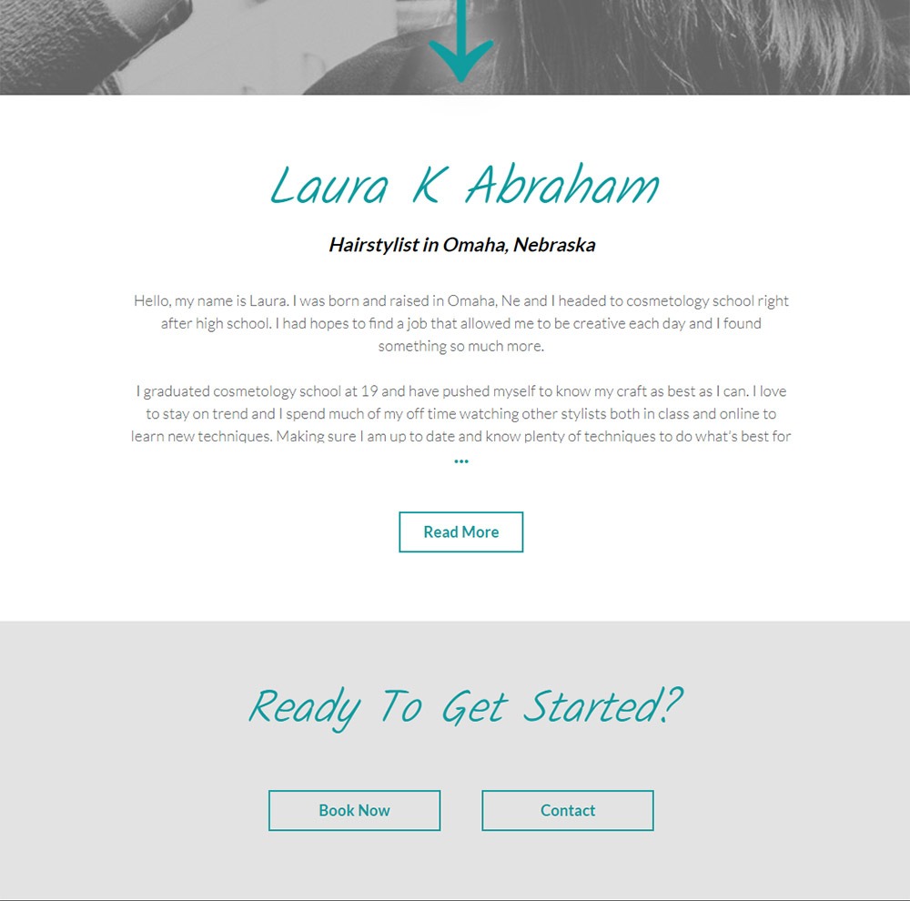
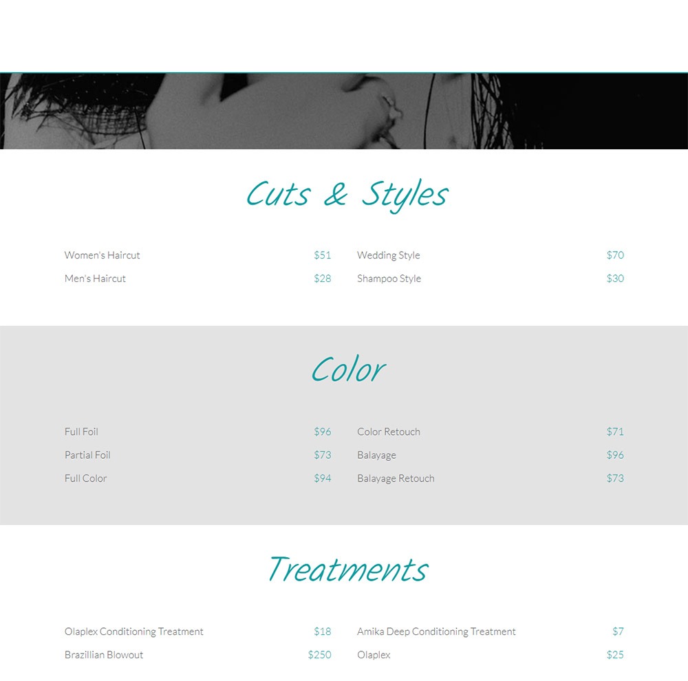
Let’s take these sections below as examples. They are two separate pages on the same website.
The images above are one example of web design consistency without being identical. You can clearly tell these are different pages, but they do maintain the same design trend and inherit an overarching theme.
How to keep consistency throughout your design
#1 – Common elements
Keep your buttons, drop-downs, input fields, contact forms, headers, sub-headers, etc. styled the same or similarly. This doesn’t have to mean that every single button on your website is exactly the same, but if you use call-to-action buttons in your content, they should all be styled the same. All of your search forms should be styled the same. All of your forms should be styled the same… You get the gist here.
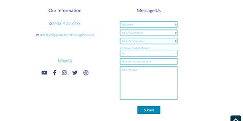
As you can see above, the headers, input fields, and buttons keep a consistent theme. The size, color, or placement might change but it keeps the design trend of the website going. We aren’t using random colors, or different fonts. We’ve chosen specific design styles and our elements follow suit, even if they have some differences.
#2 – Size and spacing
Keeping consistent web design doesn’t always relate to borders, fonts, and background colors. One method to maintain web design consistency is to keep uniform spacing and sizing across your website sections and elements.
In both examples below we’ve kept consistent spacing between our featured images, post title, post meta, post content, and read more buttons. Even though we have changed the colors, button text, and added an author image, we have still kept the overall spacing and size consistent throughout our design.
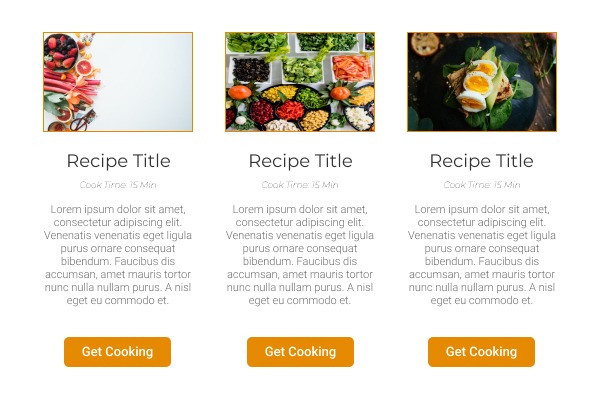
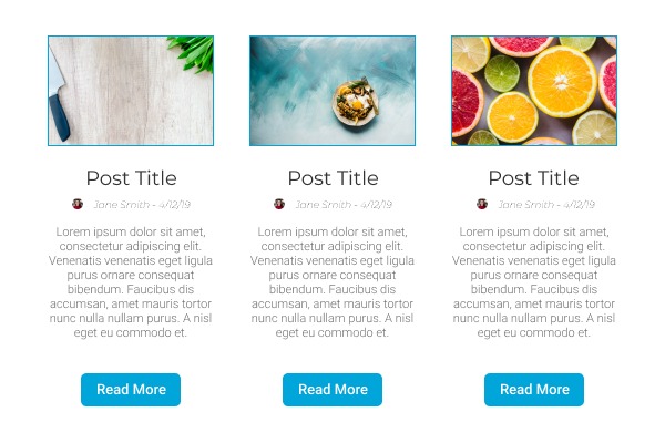
You might want more spacing between the title and the meta text, or maybe you want larger images, or different buttons. That’s fine! That idea is to keep the web design consistency concept in mind when designing your layouts.
#3 – Color Palettes
Defining your color palettes is an important step for web design consistency. Utilizing color as a design tool is a great way to differentiate sections and elements of your website. That being said, you want to make sure that you are staying on-brand. To do this, define your brand or website colors before adding or changing anything on your website.
Let’s look at some more examples(are you tired of examples yet? I’m not, I love them).

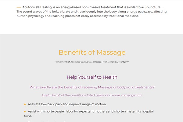
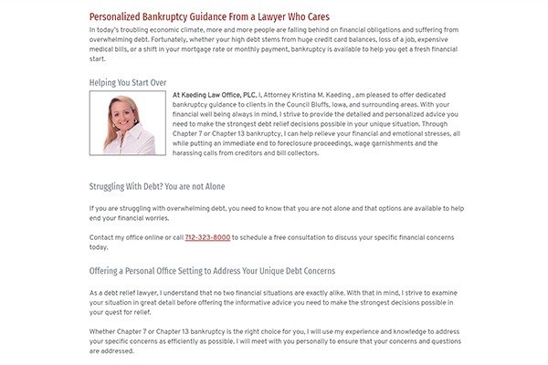
The above examples illustrate how you can utilize colors to differentiate content sections, titles, bullets, etc. You can utilize your color palette to highlight specific pieces of content in order to make them more eye catching, without compromising your web design consistency.
As you can see, a specific color palette was defined for each of these websites, and the pages utilize those colors in different ways. To delve into this a little deeper, let’s take the first example and break it down. We have two headings(h2), two paragraphs(p), and an image. We are differentiating the two sections by changing the background color, adjusting the color of the headings, adding a border on the image, and keeping consistent spacing – see size and spacing. These are subtle adjustments, but they make a big difference.
#4 – Header and footer
Your header and your footer are your pages start-point and end-point. You can think of these as the frame of the page. Maintaining consistency with your header and footer across all pages on your site will showcase your uniform and stable design across the site. Even if the content of the pages differ, the viewer will know they are on your website because the frame stays the same.
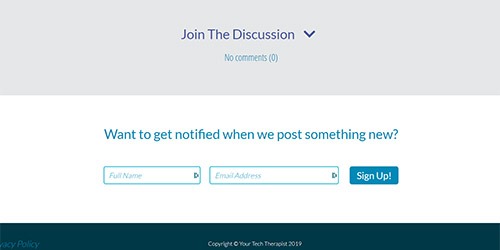
This may seem like an obvious one, since the majority of websites have completely static headers and footers across all pages. They don’t tend to change much, if at all. That being said, it’s still important to keep this in mind, as you can utilize the header and the footer in unique ways. For example, on the Your Tech Therapist website we utilize the footer to display navigation elements that are not the primary focus, and we include a “Get Started” call-to-action button with some added flair to grab attention.
The important takeaway here is that the header and the footer do not need to always be traditional, but keeping them relatively static across all pages is important for the web design consistency concept that we have been discussing throughout this article.
Final thoughts
There are so many ways to design a website, and creativity is the most important thing. So many websites follow a very specific rubric. In fact, many of them are templatized completely. This makes them all feel the same. Distinctiveness in your design will keep your website from falling into the “void of sameness” that so many websites find themselves in, without an a way out.
That being said, you cannot forgo consistency in an effort to be unique with your website design. This will alienate many potential viewers or customers that may find your website difficult to navigate and understand.


Join The Discussion
No comments (0)